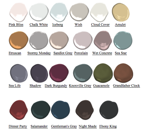
Color trends. When choosing colors for your wedding how do you decide. Simply put, pick the colors you like not necessarily what is trending. However, I always like to check out the new colors that the paint companies introduced for the year. My go to paint color is always Benjamin Moore They hit a homerun with paint colors, besides I like the names of the colors. Obviously, some of these colors are not meant for a wedding but many are the perfect back drop for your reception colors. When picking colors, it is important to visualize your ceremony and reception in order to bring a pop of color to the room. I also like to look at the color chart to see the colors in lighter tones. Sometimes picking one color with lighter variations is a good thing. See below the colors from Benjamin Moore. After looking at the paint colors I thought where else could I get more suggestions for color trends for more wedding and social events. So I looked at the Pantone color of the year. I believe these colors are more suited for weddings, receptions, and social events.

THE PANTONE COLOR FOR 2017
Pantone Color of the year is Greenery This color is easily paired with many different subtle or even bold dark colors. The Pantone Color Greenery crosses over fashion, décor, graphic design and much more. This color is easily added to any wedding day, ceremony, and reception. The green tones can be easily added by simply adding greens to the wedding reception centerpiece. Some florist choose just greenery for the bridal centerpieces. Green is a great accent color many color schemes. We had a wedding reception in February where the bride picked green table cloths with accents of purple for the cake tables Picture. Choose from the palettes below to find your perfect combination of colors.


Ultimately the color scheme is totally up to you. Women do have a favorite color and we typically choose that for our wedding color. What I suggest keeping in mind are What are your colors and vision for those colors for your reception and ceremony? Do you want a bold color for the bridesmaids or more subtle color for the dresses with the bold color displayed in the bouquets and centerpieces? What time of year is your wedding? What flowers are in bloom that time of year? All these questions play a part in choosing your color scheme. I suggest using a maximum of three colors. Maybe you don’t want any colors just hues of white and natural which is perfectly fine too. At The Wellington Fishers, we see many creative selections of colors. One of my favorites is a recent bride. She picked green as her main color with hints of purple and black as a back drop. She incorporated the chairs as part of her color pallet so no chair covers were needed. She put her money in the centerpieces for the head table making a color statement entering the room. Notice the black back drop giving the cake table a statement with the purple. Being a creative and using the right color in the right place will make a big statement.
Happy choosing
The Wellington Fishers
Cami O’Herren
317-712-3475


